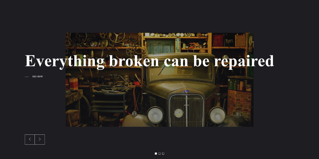
Layout Experiments
One of the challenges in the architecture of Momentum was to separate layers for layouts and information modeling. As designers, we can control the design decisions of HTLM layouts independently from the design decisions at the level of information architecture.
In this gallery, we give numerous examples of purely static HTML/CSS layouts to showcase almost absolute freedom when designing them. You can imagine each example to be a basis for further dynamic modeling if necessary. The flow would be to design static layouts and then perplex them with the layer of dynamic information coming from a database.
-
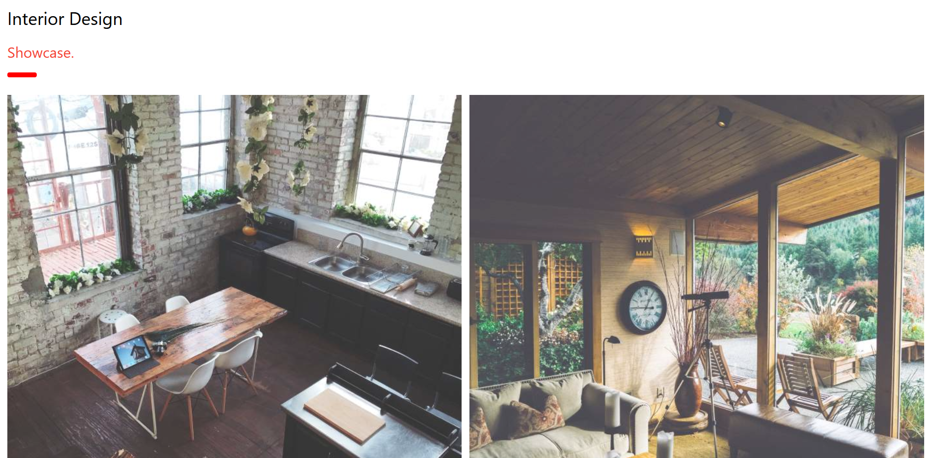
W3CSS Interior Design
One of the W3CSS framework themes, parsed in Momentum.
-
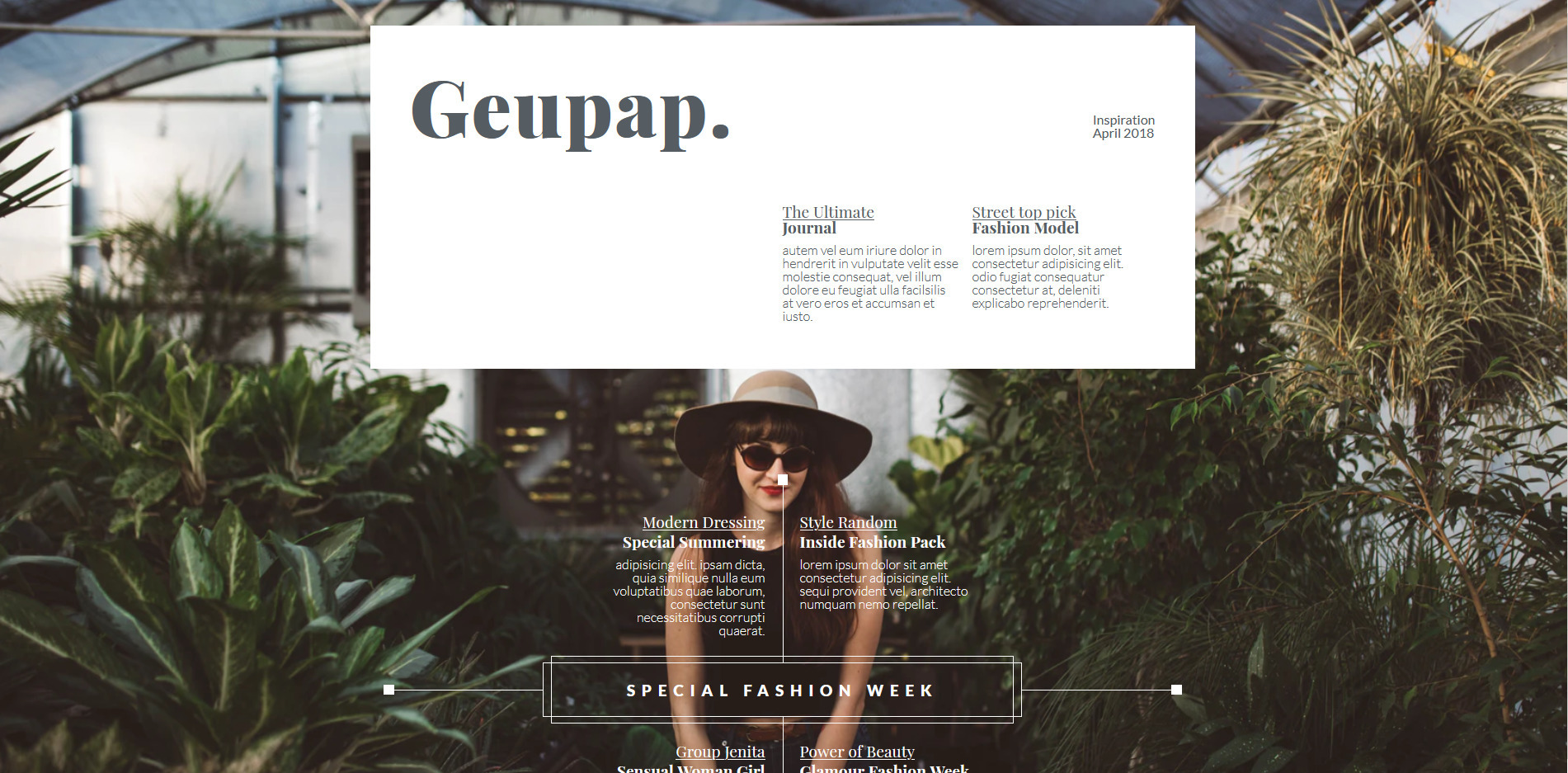
Geupap - Magazine Layout
Example of the magazine page layout.
-
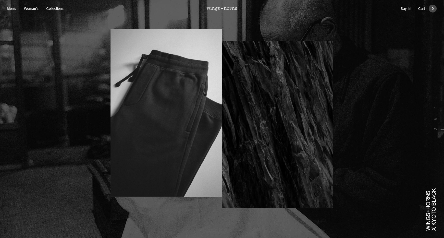
Black Is Timeless
Carousel with transitioning effect. Use scroll.
-
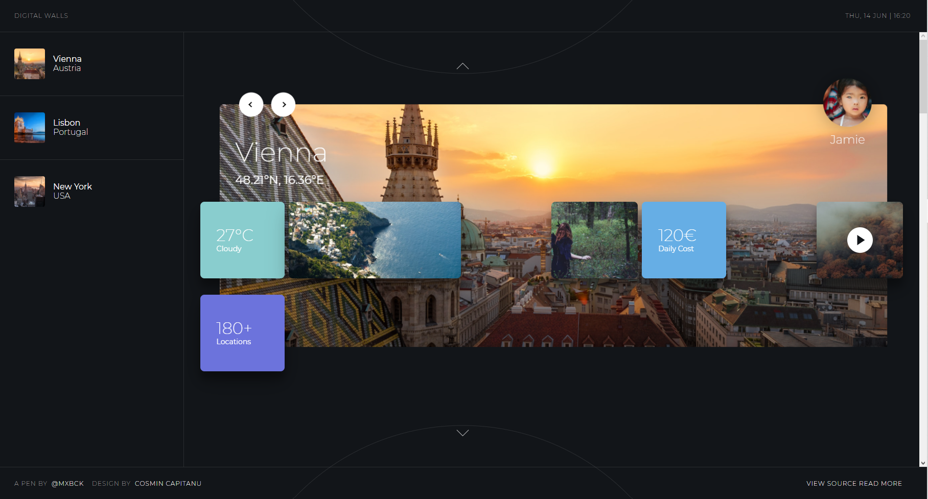
Digital Walls
CSS, paralax demonstration.
-
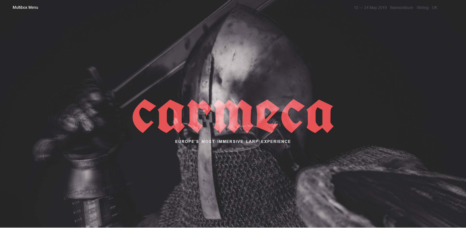
Carmeca
Demonstration of grid navigation.
-
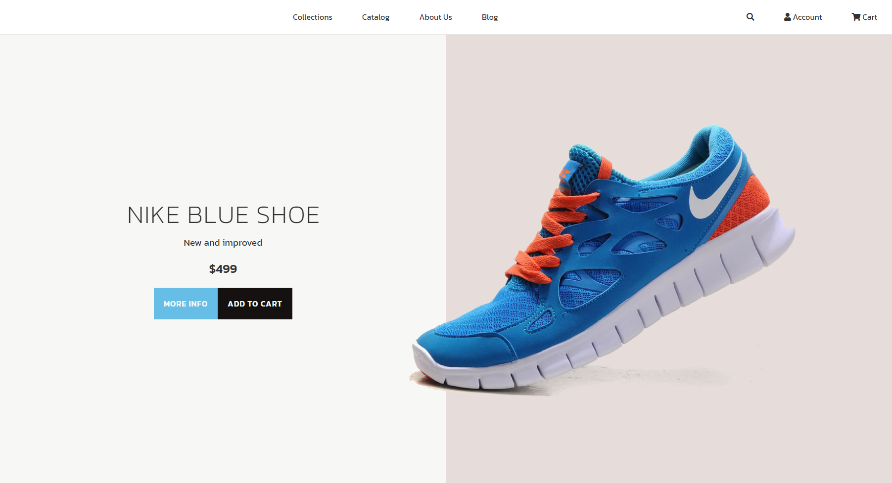
Nike Blue Shoe
An interesting layout based on aspect ratio media queries rather than an width based solution . The only thing that triggers change in the layout is weather layout cadre is vertical or horizontal.
-
Parallax Slideshow
A description of the item.
-
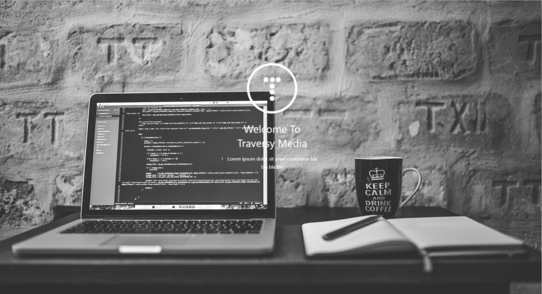
Traversy Media
A description of the item.
-
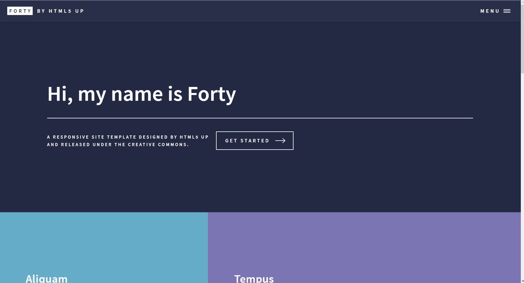
Forty
A description of the item.
-
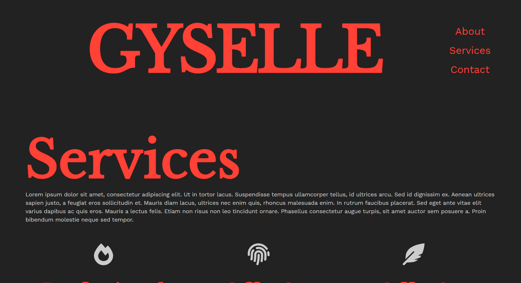
Gyselle
A description of the item.
-
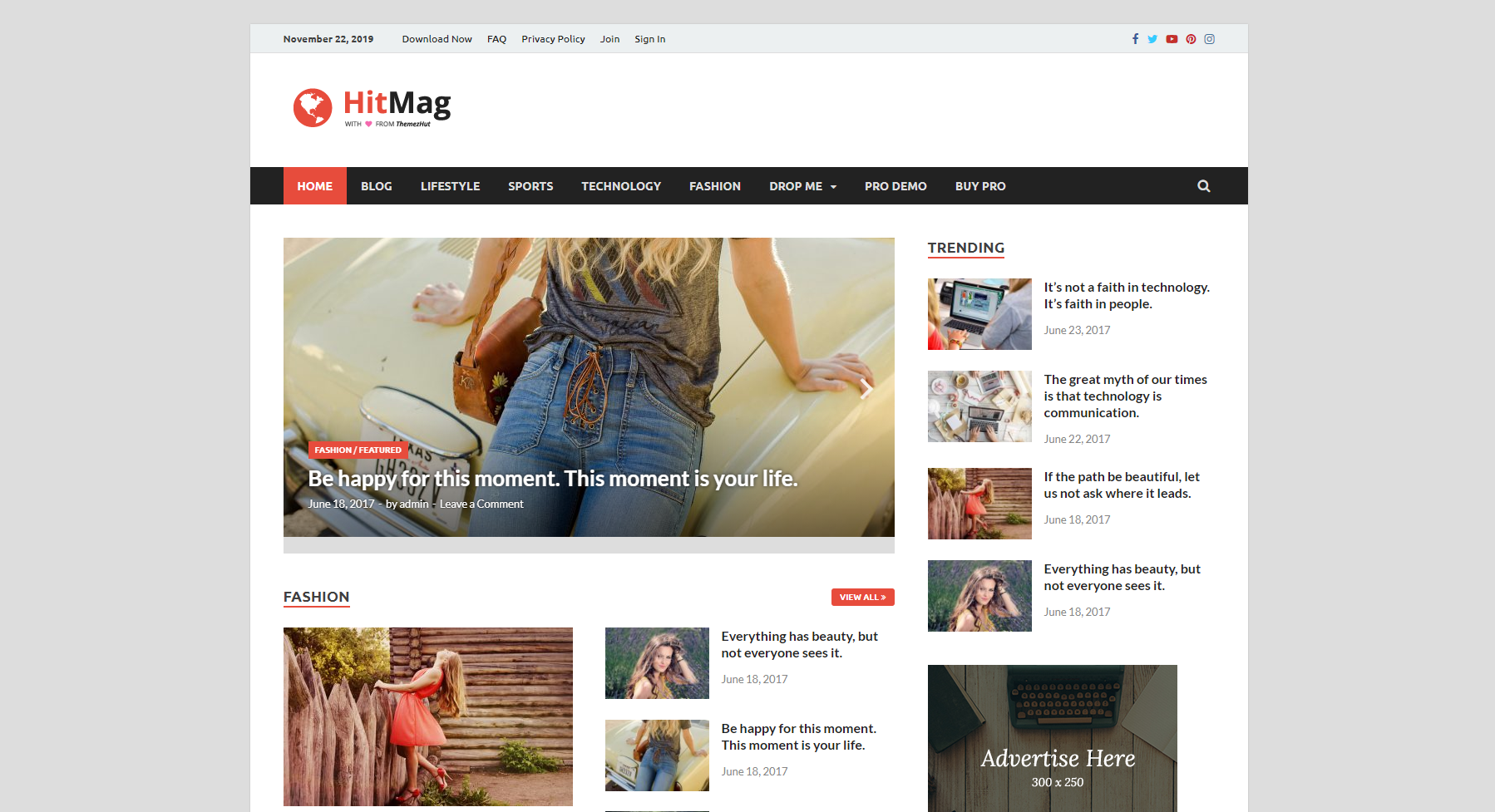
HitMag
A description of the item.
-
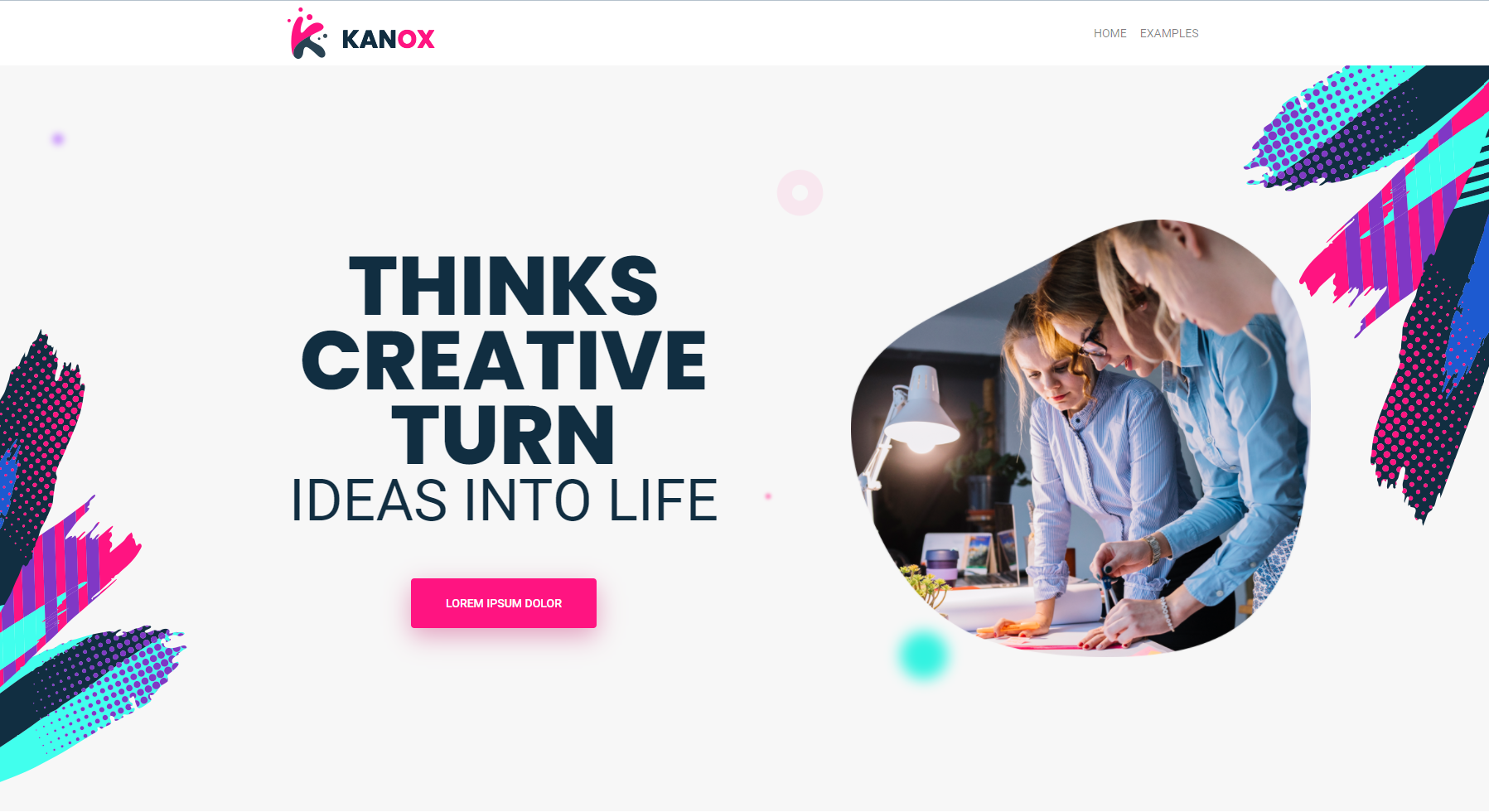
Kanox
This is the parsed Bootstrap4 theme.
-
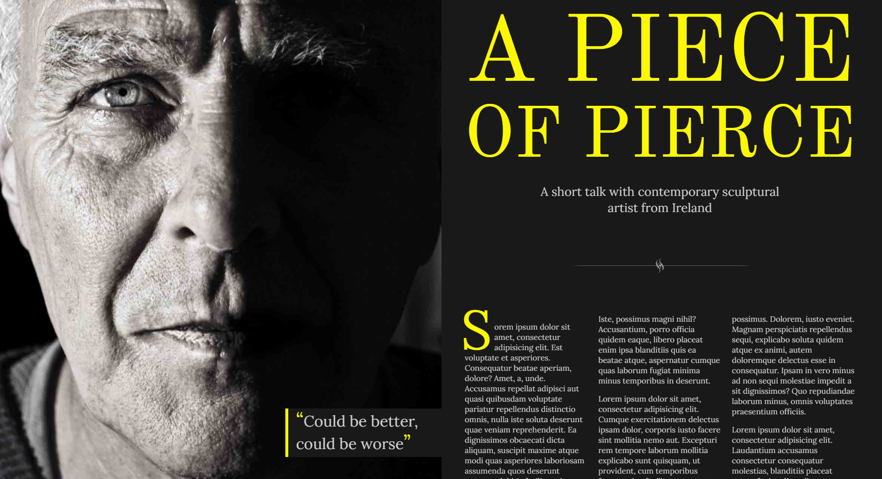
A Piece Of Pierce
A description of the item.
-
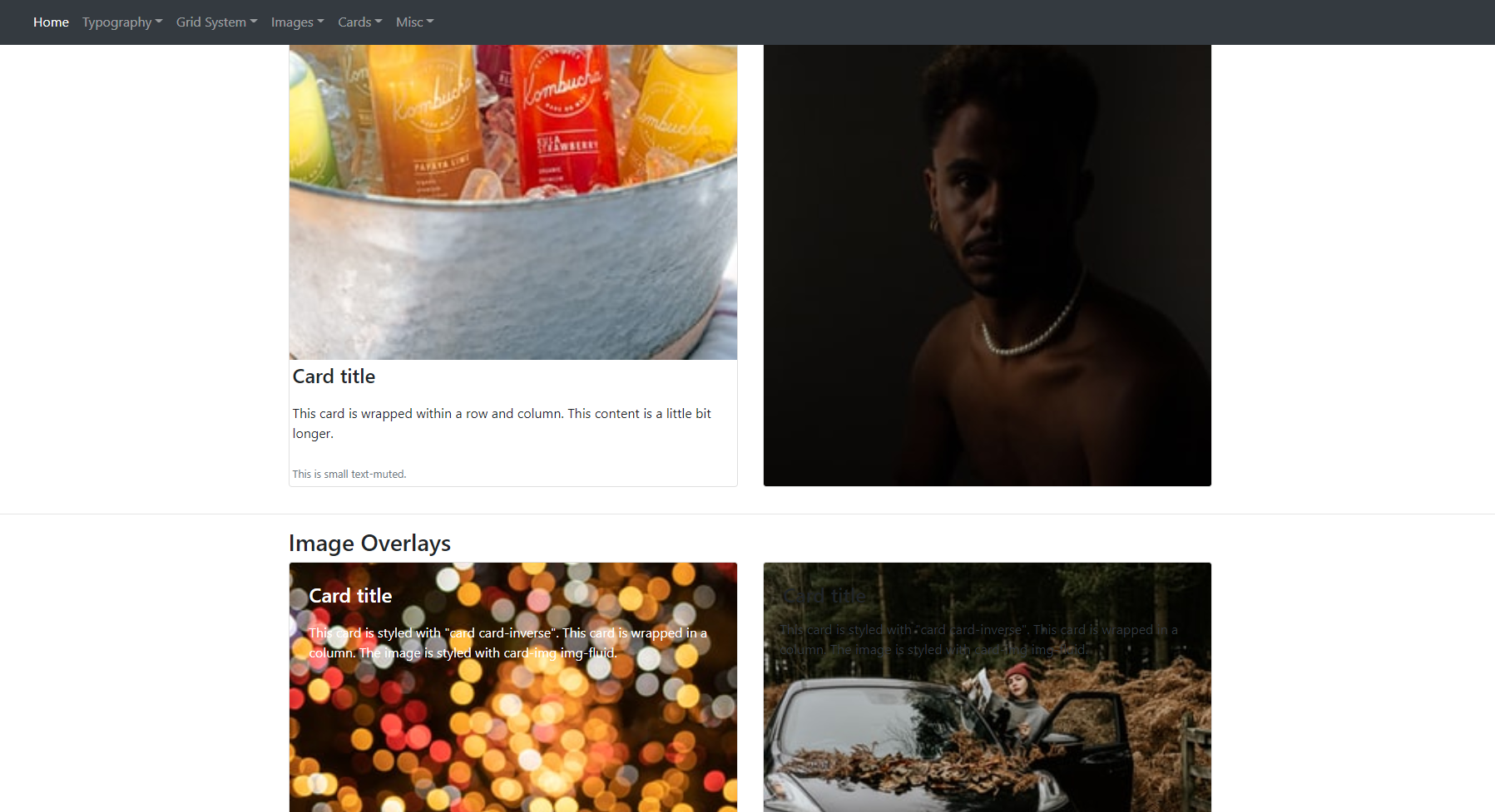
Bootstrap 4 Kitchensink
A description of the item.
-
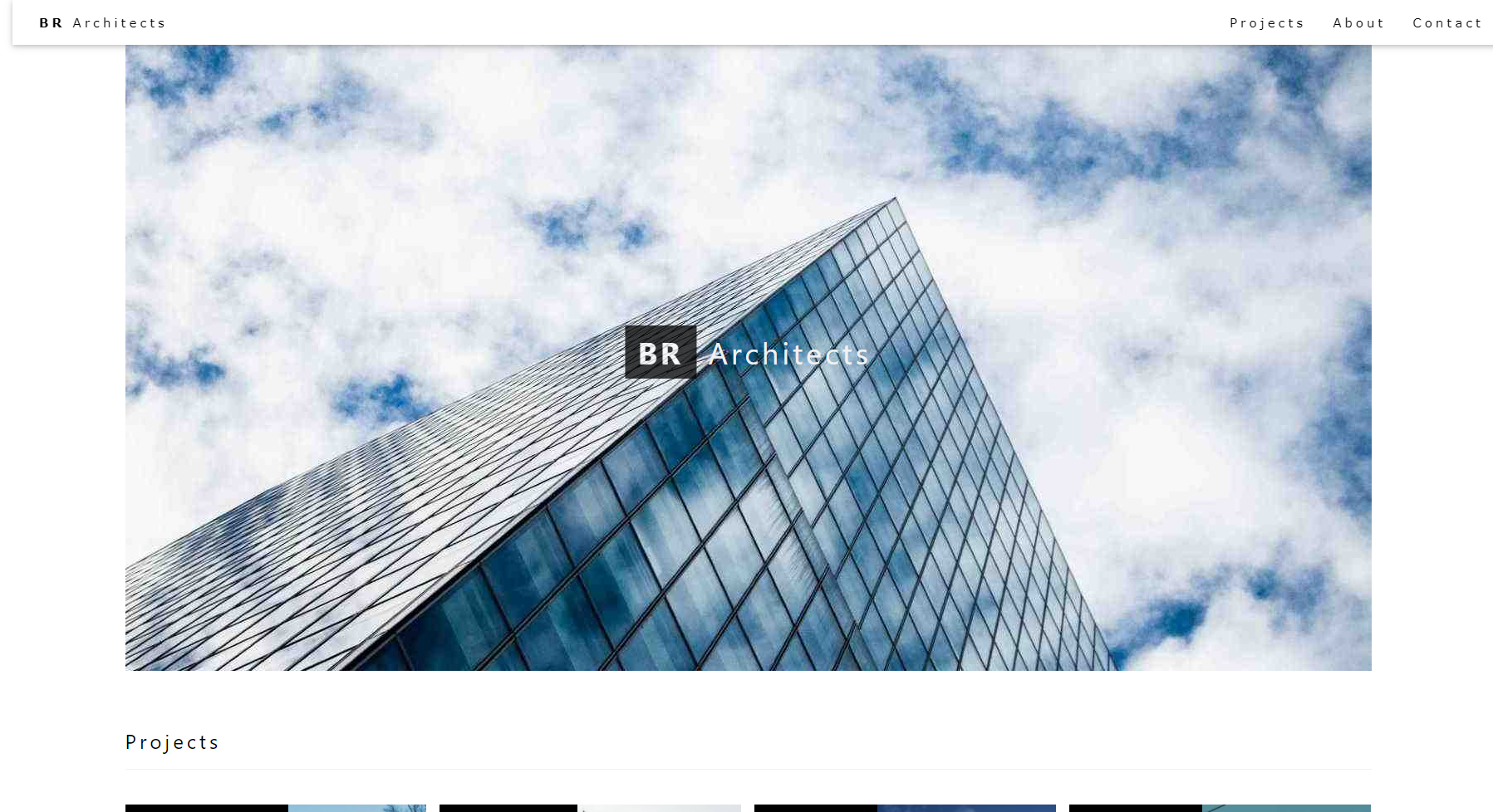
BR Architects
A description of the item.
-
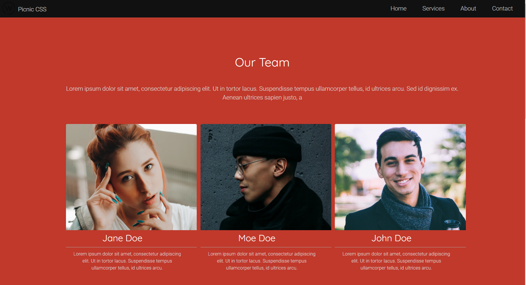
Picnic CSS
A description of the item.
-
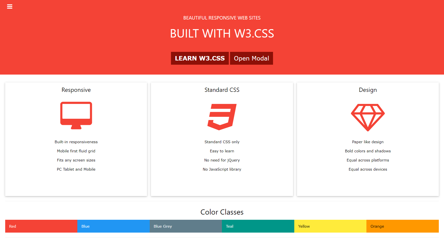
W3CSS Project Template
A description of the item.
-
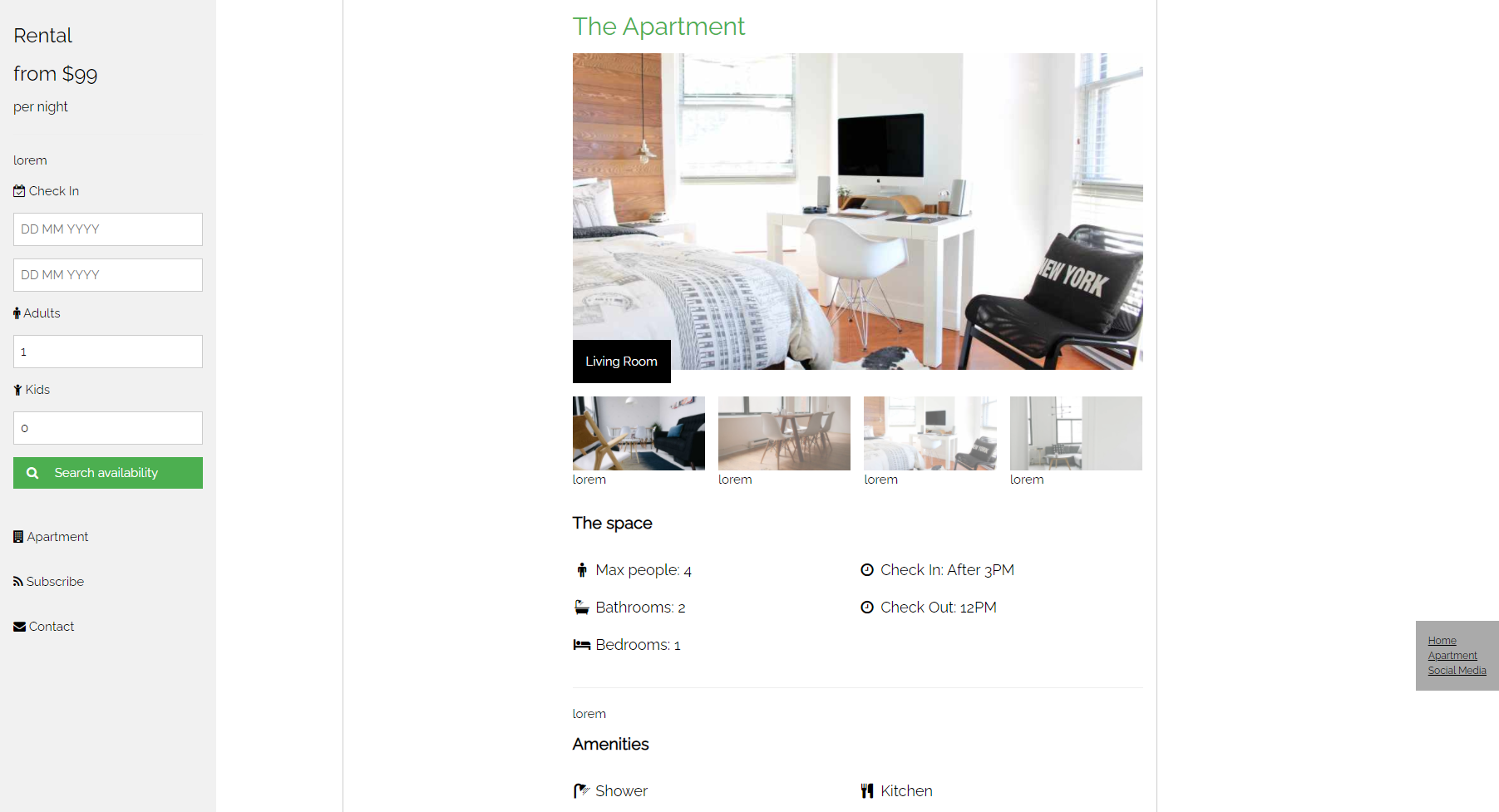
W3Css Apartment Theme
A description of the item.
