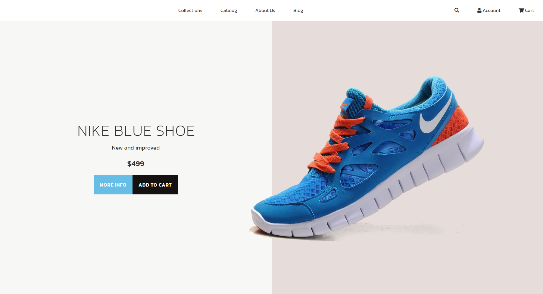
Example:
main {
    display: flex;
    flex-direction: column-reverse;
    flex-grow: 1;
}
@media screen and (min-aspect-ratio: 10/8) {
    main {
        flex-direction: row;
    }
}
An interesting layout based on aspect ratio media queries rather than an width based solution . The only thing that triggers change in the layout is weather layout cadre is vertical or horizontal.
Example:
main {
display: flex;
flex-direction: column-reverse;
flex-grow: 1;
}
@media screen and (min-aspect-ratio: 10/8) {
main {
flex-direction: row;
}
}